CONTRIBUTIONS:
Visual Identity, Visual Communication, Layout Design, Accessibility & Usability
TOOLS:
Figma, InDesign, Illustrator, Canva Pro
DURATION:
Ongoing (June 2025-)
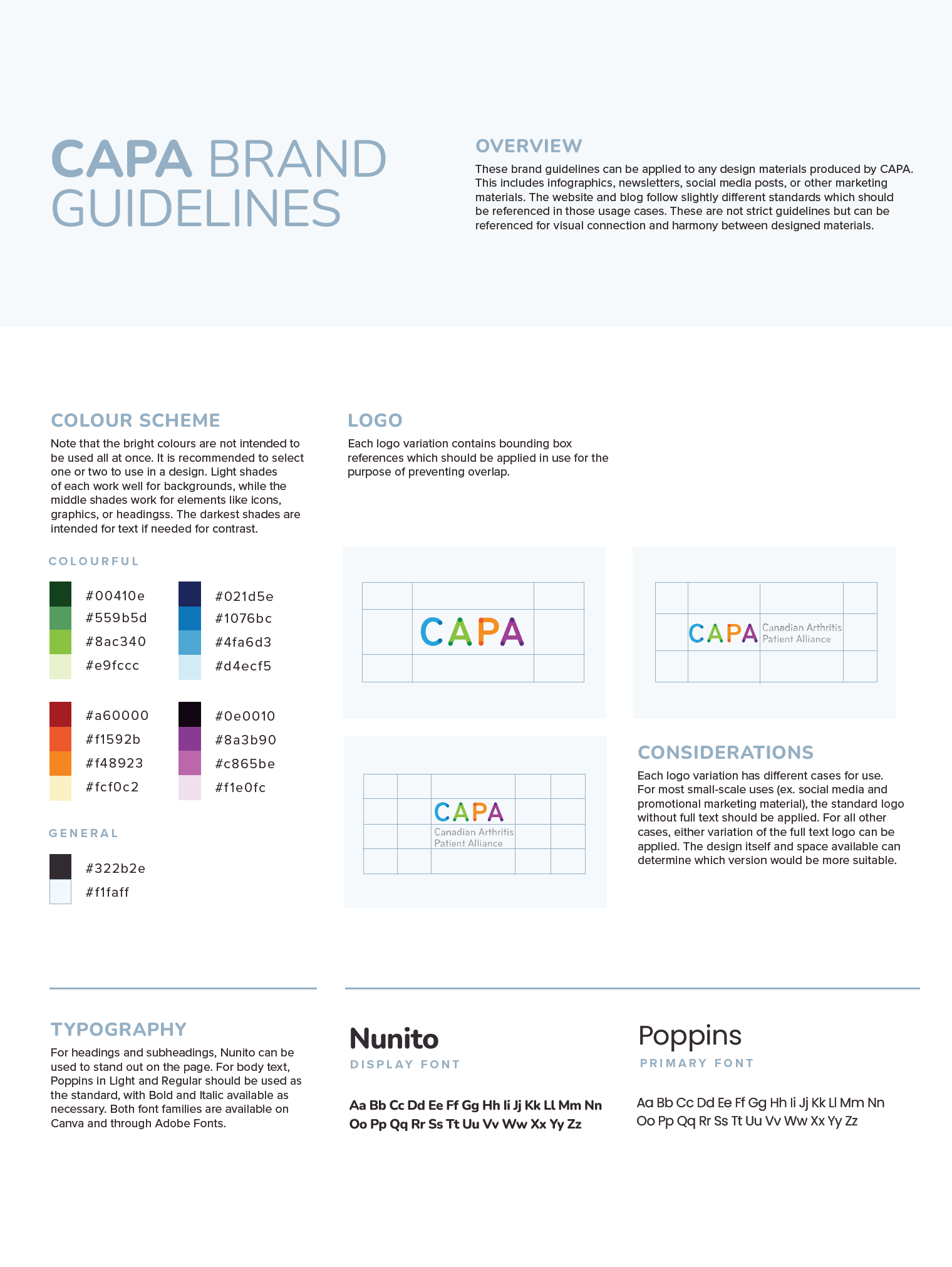
Simple overview of the updated branding guidelines for quick distribution.
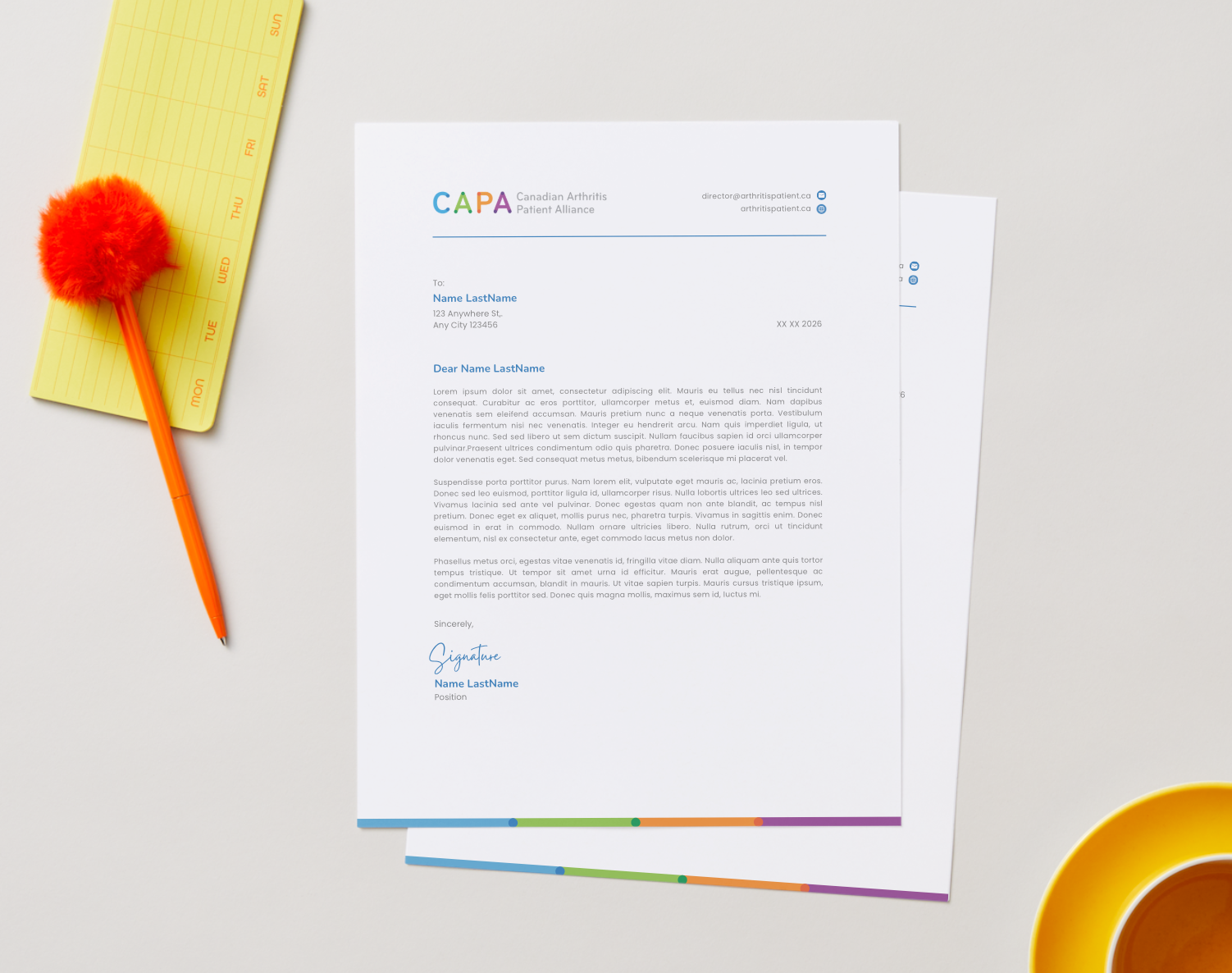
Letterhead design.
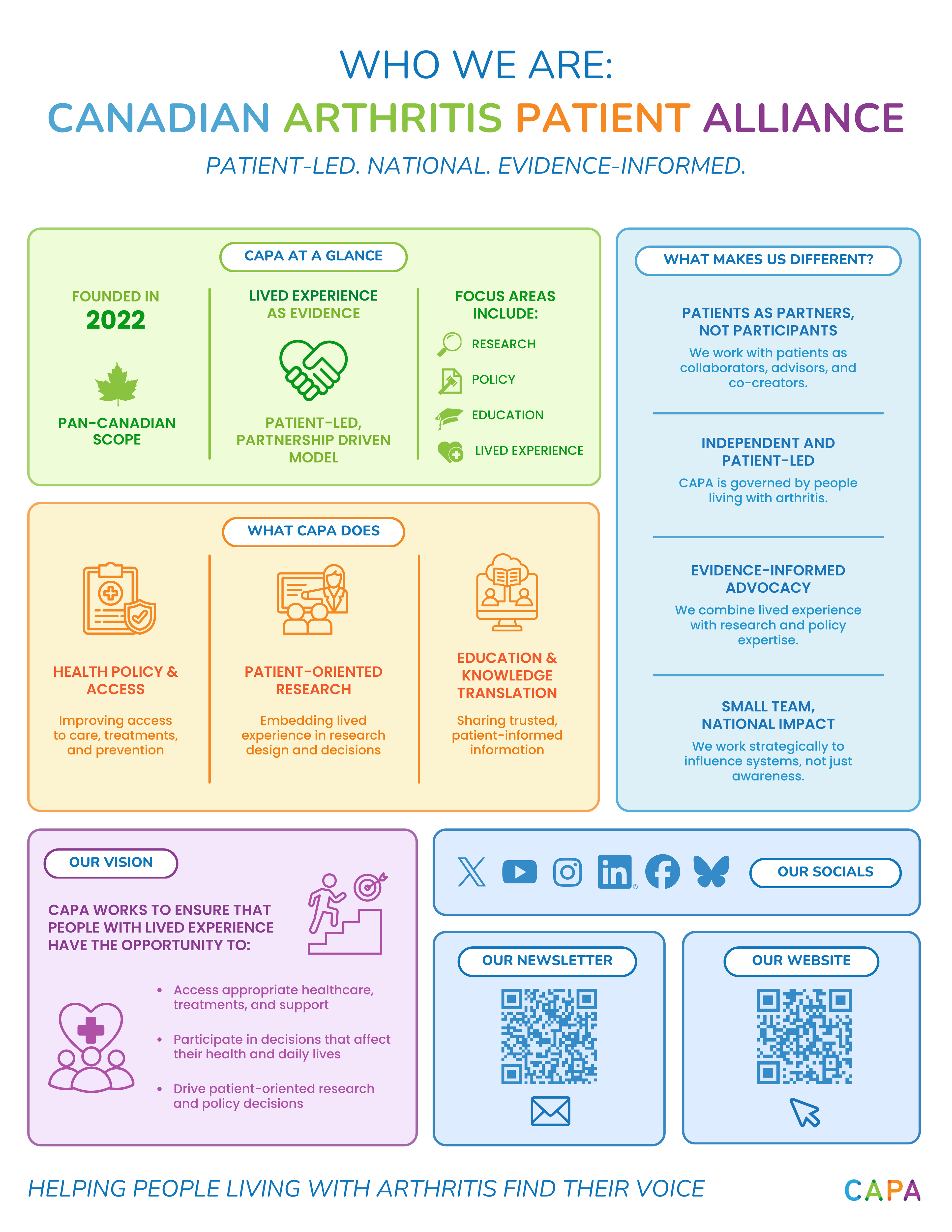
Summary of the nonprofit identity to share with stakeholders.
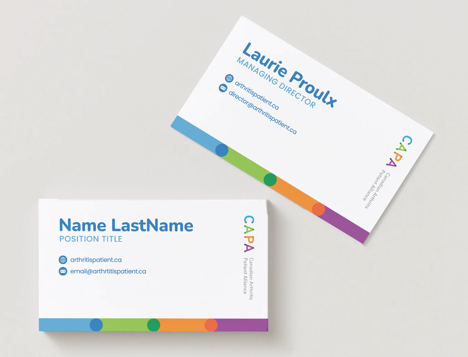
Business card template design.
PROJECT SUMMARY:
As a part of my Graphic and Web Design work with the Canadian Arthritis Patient Alliance (CAPA), a national patient advocacy organization, I transformed their existing logo and typography into a comprehensive visual identity system.
APPROACH:
I began by analyzing CAPA's existing visual assets, focusing on the logo, typography, and organizational values. Rather than introducing an entirely new identity, I sought to identify opportunities to extend and strengthen the existing brand.
Using the logo as a foundation, I developed an expanded colour palette and supporting visual elements that could be applied consistently across print and digital formats. Particular attention was given to accessibility, readability, and adaptability to ensure the system could support a wide range of content, from educational resources and advocacy materials to social media campaigns and event promotions.
Once the visual framework was established, I designed a collection of reusable templates and branded assets that could be easily implemented by staff and volunteers. This approach emphasized scalability and consistency while reducing the time required to create future communications.
PROJECT BRIEF:
CAPA required a more unified and recognizable visual identity that could be applied consistently across a wide range of communications. The goal was not to redesign the organization's existing brand, but to expand upon it by creating a flexible visual system that reflected CAPA's patient-centred mission.
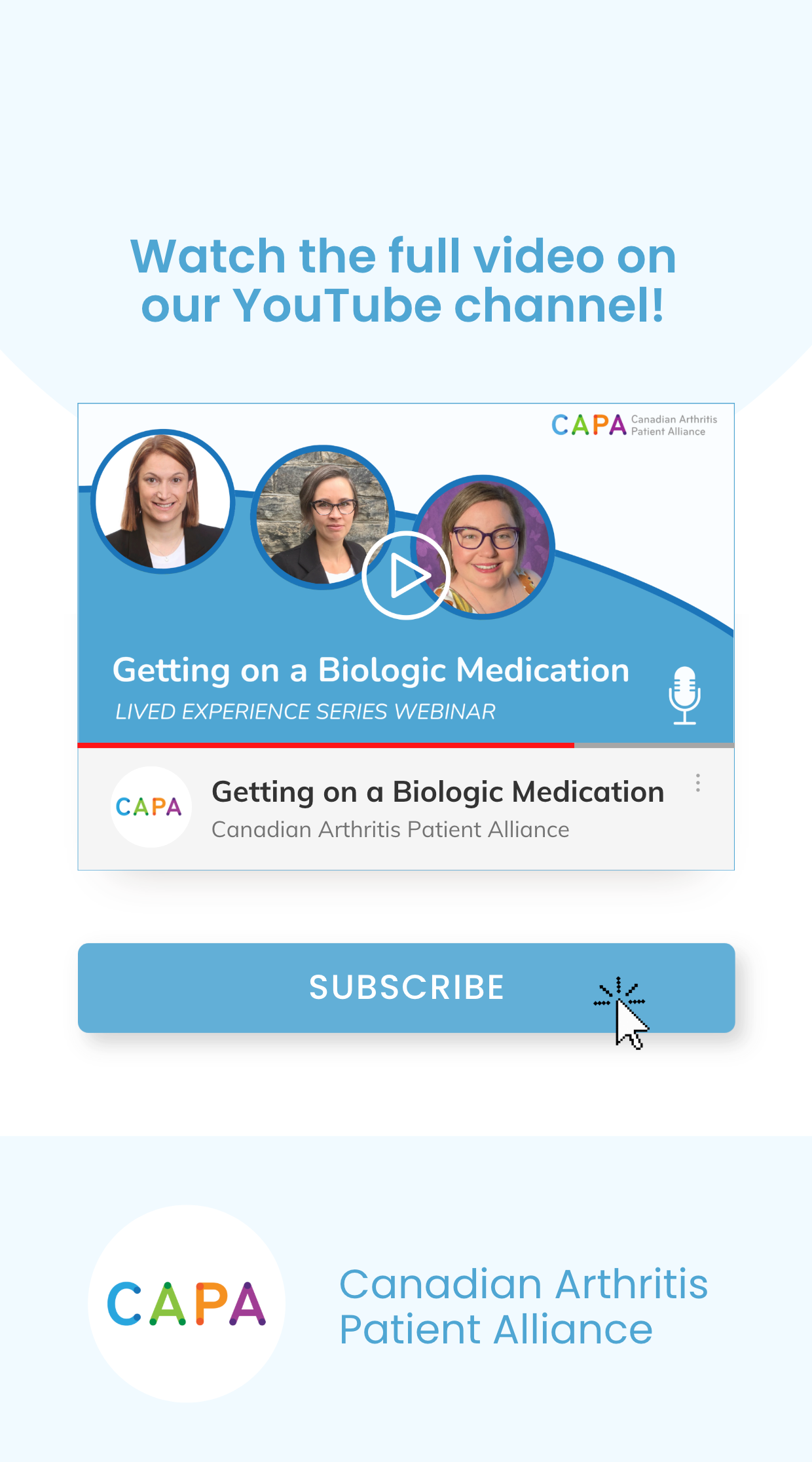
The project included the development of brand guidelines and a suite of branded assets, including letterhead, business cards, social media templates, YouTube graphics, and other communication materials.
OUTCOMES:
The project transformed a collection of individual brand elements into a cohesive visual identity system. The expanded brand provided CAPA with a stronger and more recognizable visual presence across its communications while maintaining continuity with its existing identity.
The resulting system included visual identity guidelines, an expanded colour palette, a letterhead and stationery, business cards, social media templates, YouTube graphics and thumbnails, and presentation and communication templates.
By creating a flexible and accessible design system, CAPA gained a set of tools that supports consistent branding across print, web, and social media while helping communicate its mission more effectively to patients, healthcare professionals, researchers, and partners.
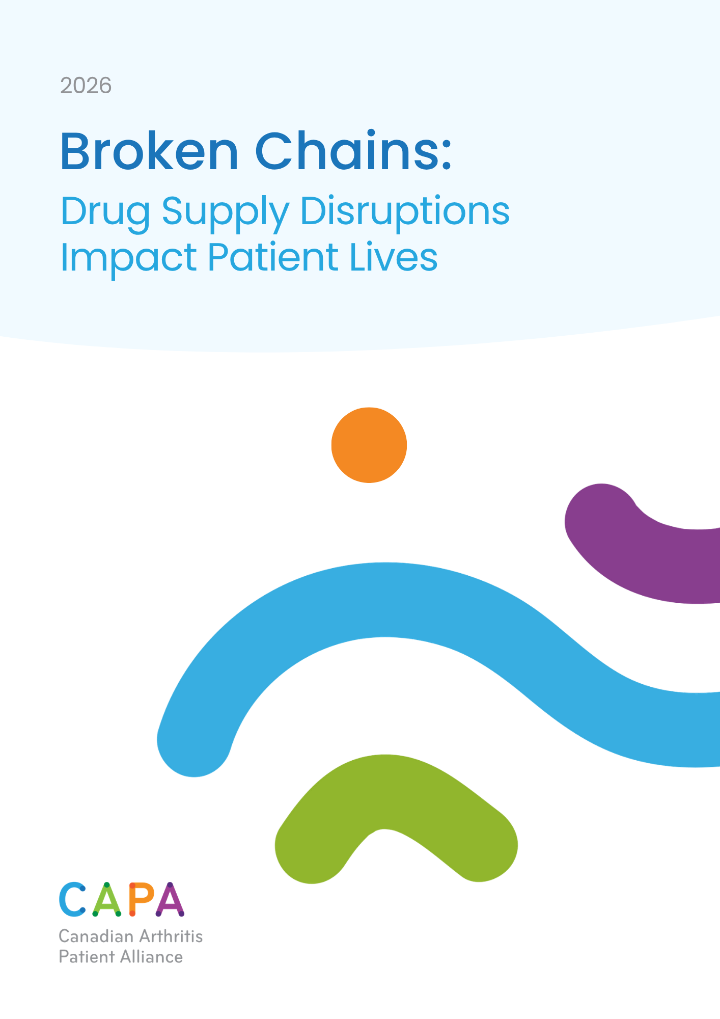
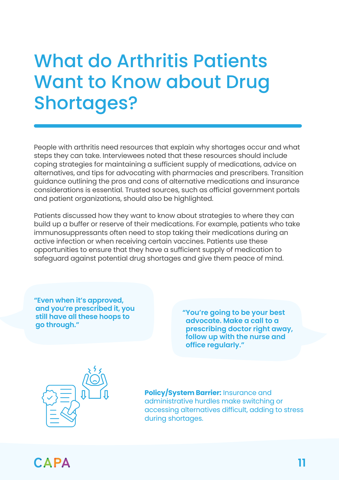
Report layout I designed and implemented content into.
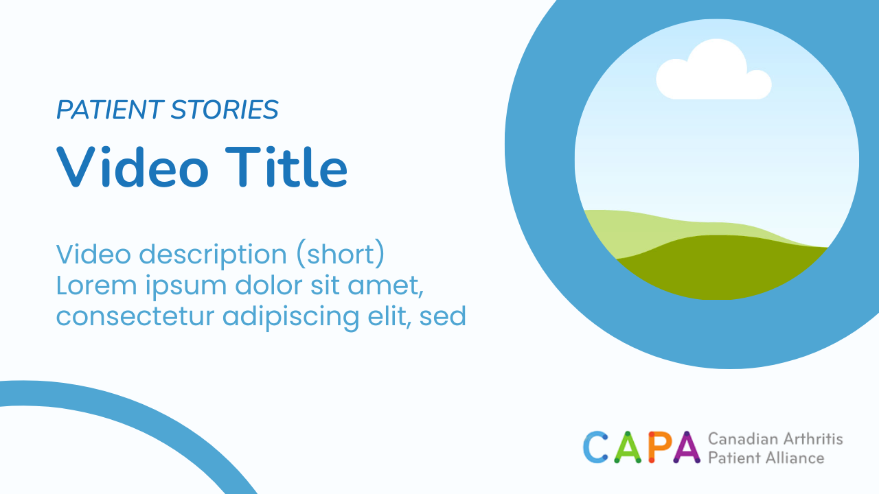
YouTube thumbnail template 1.

YouTube thumbnail template 2.
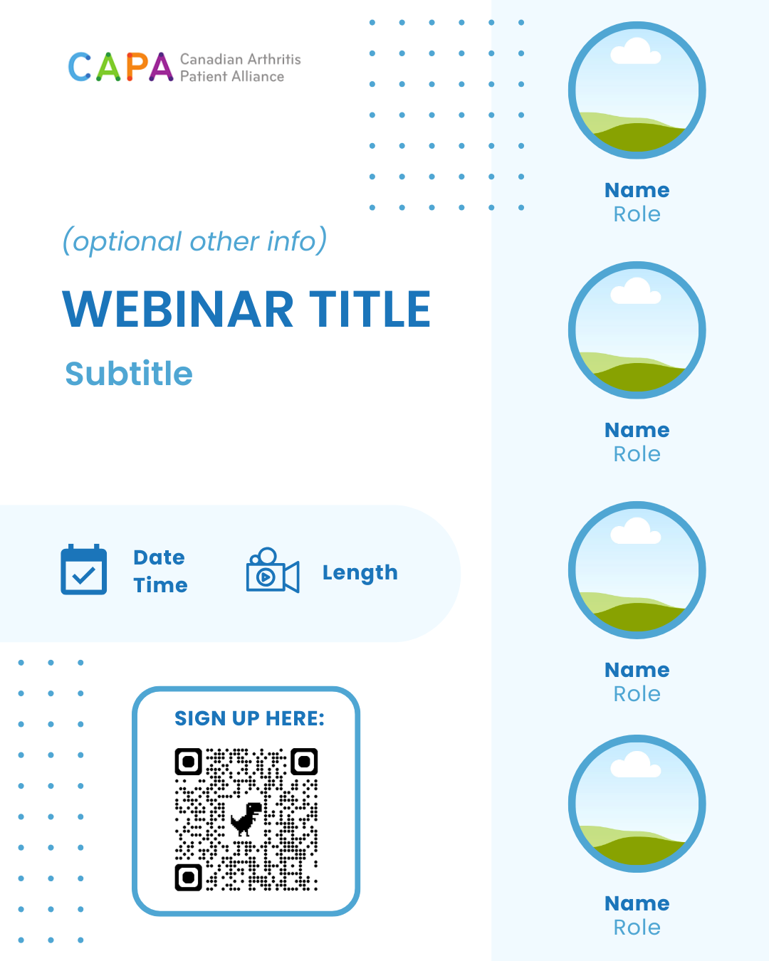
Webinar announcement for socials.
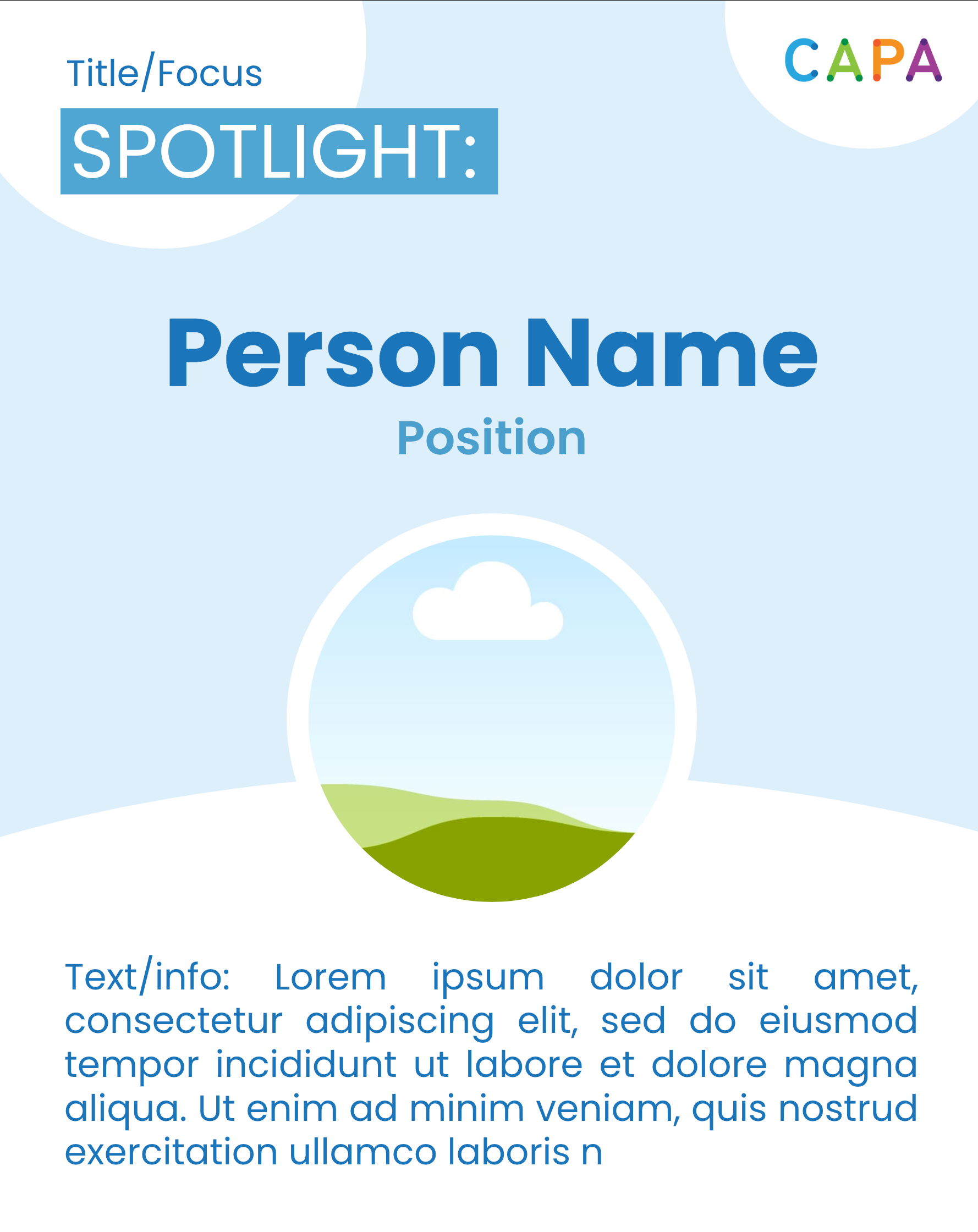
Person spotlight for socials.
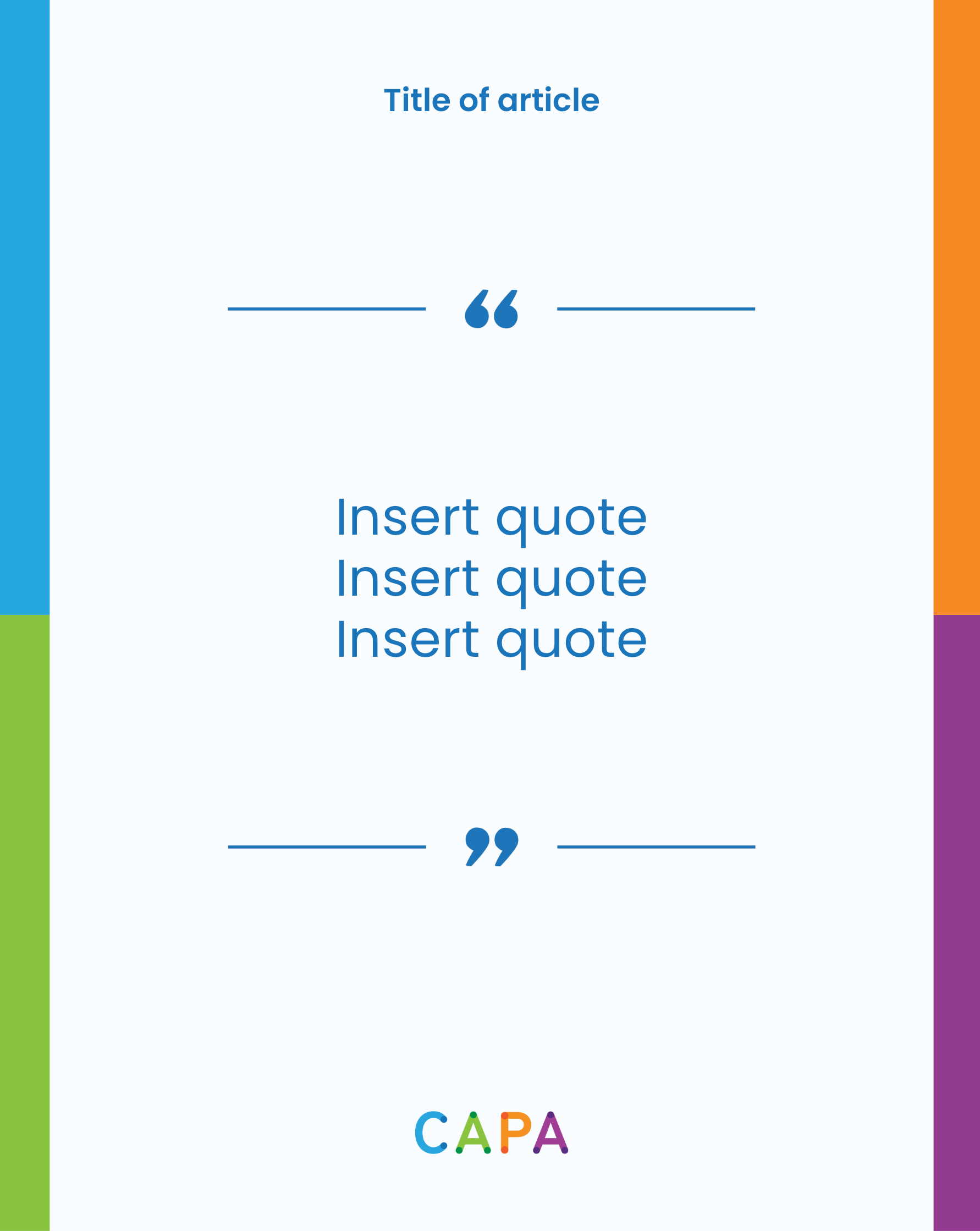
Quote feature for socials.
Reels endscreen.
Templates I designed for socials content, following a consistent brand identity across all formats (including reports, the website, and infographics).